Saturday, October 25, 2008

PROJECT 3: Treasuring Time

HOURGLASS URN


The time i wanted to treasure was the entirety of someones life in memories. I chose to make an urn as a medium thought which to remember someone who was loved who is now lost.


The main concept of the urn is that it has a funnel type lid which when the ashes are poured through act like an hourglass which the family may sit around and watch and bring back all the memories surrounding the persons life. It can be used as a moment to sit silently and reminisce on the good times.


The urn also incorporates a base for it to sit on while on the mantle piece or shelf which has a light underneath to act as a nightlight and to remind the user that the person lost is still with them.


It is made from frosted glass so that the askes can be seen still through the urn which helps to remind the user that their loved one is still there inside.

Wednesday, October 8, 2008

Seymour Powell: Designing Dream Machines

Throughout the design process there are many factors that will influence the outcome of the design, each and every one must be treated equaly and adressed to the best of our ability to produce a quality and sucessful product that not only satisfies the needs of the consumer but also achieves the brief from the client, your main objective.


The video was very interesting as it raised many issues with the design process that all designers must endure for their project to be a sucess in the market place.


It explains about the conceptual stage and how it is that research and a broad spectrum of thinking that allows small ideas to develop into big outcomes. It was interesting looking at how all the steps taken in designing and modeling and marketing all make a huge difference in the end, and that it is attention to detail in the small areas that can have the biggest effect on the final outcome.


Wednesday, October 1, 2008

Task Four - BAD DESIGN

WINDOW SWITCHES


I noticed in my car that it is quite confusing which window switch to use for which window and also the direction to pull or push the switch to get the window to go up or down.


This picture shows the existing design. As you can see the design requires text for the driver to understand which button for which window. However it is ironic that in designing what i would have thought to be a safe car, you must draw your eyes from the road towards the switches to see which window to put down which means that you are no longer looking at where you are going.

The other problem with the design is that the buttons are push and pull back and forward. This is in no way indicative of which way raises and lowers the window making it even more difficult for the driver to easily put his or her window down.
I believe that a good design for a window switch would be one that is very easily understood by the user and also very easily found by the user without having to take his or her eyes off the road.

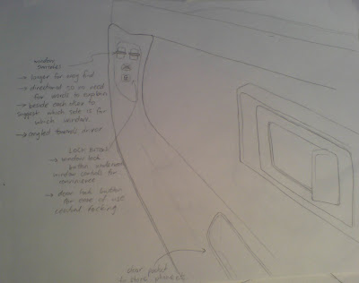
I have thus come up with this idea of rearranging the buttons to help the user to more clearly understand which button is for which window and which way to push the button without having to read any instructions or take their eyes off the road.


This greatly improves the users ability to understand which button is for which window as they are placed beside eachother and when mounted in the car are on the left and right side. also as the panel is mounted verticaly not horizontaly it is common sense that to put the window up you push the switch up and to put the window down you push it down.

This design requires no text at all to instruct the driver what to do and which switch to use. I've also added the window lock button underneath for easy acess and in a conveinient place.

Sketch of it in the car. Notice the enlarged buttons and also that its angled towards the driver so that it is easily acessible.

notes read:

larger for easier find

directional so no need for words to explain

beside eachother to suggest which side is for which window

angled towards the driver

The design also features a window lock button and a door lock button conviniently placed underneath and a door pocket at the bottom for phone, money etc.

Tuesday, September 30, 2008

POSTAL PRESENTS

iPod Flat Case

After recieving in the mail each christmas and birthday from my uncle an iTunes gift card, i realised that there can be more to a $20 card of music credit included in the package to better sense that you care about what the reciever is interested in.


The idea behing my iPod flat case, is that along with sending your loved ones an itunes gift card, a personalised (by music genre) protective case comes with the card to give the reciever more of a feeling of being understood and known by their relatives, or friends as they have taken interest in what they like instead of just sending a generic card with $20 credit

As shown in the instructions the case and card both pop out of the same piece of A4 EVA foam to be manipulated and folded to create the case.

the case comes in many different styles, depending on different genres of music. some examples are bellow:


These two made from black and white leather are suited to the country music style whereas the designs i made in 3D form are for rave and punk rock genres.


The punk style case features metal stud clips and tartan upholstery to give teenage rock feel.


The rave edition features glow in the dark lining and a glow in the dark laser light pattern on the outside.


Wednesday, September 17, 2008

STORY OF STUFF - Annie Leonard

The video raised some very important and very interesting issues with the way we live today.

It was amazing to hear the extent of the damage we cause to the earth and its resources just to have our products which are designed to only last for a certain time, which in the long run makes for more money to the corporations and the government. its interesting to hear that quote in the 1950's about america being so inspired to buy and consume that it would become ritual. This is how i see the world today, as governments being a big corporation revolved around money and nothing else.

another interesting point raised was about advertising and how it makes you feel bad about what you have, as apposed to advertising a good, to make you feel like you NEED it in order to feel more accepted.

overall the video had some very important issues about the way of producing goods in the future and also recycling to improve on and help to fix all the damage we have caused so far in our world of greed.


8/10

Thursday, September 4, 2008

EXPERIENCE ENRICHMENT


ERGO SLICE


For my project, i aimed it at mainly a female market, specifically a housewife, middle aged 27-40 who spends a lot of time in the kitchen preparing and cooking food for the family. Through research i found that there are many knives that claim to be ergonomic in design but seem to just be rounded.


My approach to the design brief was to create a very comfortable, ergonimic, easy to clean and easy to use knife that will provide the user with the confidence in blade shapness and durability.


EXPERIENCE ENRICHMENT


  • Ergonomic handle - fits palm and expends to give more leverage


  • Sleek woman shape with rounded edges and smooth lines


  • 2 different grips - also left and right handed


  • made from ceramic zirconium oxide - no pores = no bacteria buildup


  • ceramic knives stay sharp longer and are much sharper than stainless steel


  • No joins to breed bacteria in - one piece mould


  • Easy to wash - dishwasher safe


  • Sintered oxide bonds powder particles together by Closing pores, no pores-no bacteria


  • Flex thin ceramic - shock absorb properties


  • Metal insert to make compatible with megnetic rack


4 PLEASURES


PYSICAL


  • comfortable


  • shock absorbing


  • easy wash


SOCIAL


  • Stylish and round to match modern kitchen


  • bonds with user by fitting hand


PHYSIOLOGICAL


  • Safe


  • Hygenic


  • Comforting to use


IDEOLOGICAL


  • Confidence in quality with ceramic


  • new technologies in ceramic makes user feel superior


Tuesday, August 26, 2008

PAUL BENNETT - Designing Details

The video game me some tips in design and also some knowledge about how to design for specific marets. I found it interesting when Paul said "pick battles big enough to matter, but small enough to win" and also the idea of bringing together small to make a big difference.

The idea of looking at human interactions with everyday life was interesting eg. using the street poles to rest the trolley on, and wrapping the teabag string around the handle of the mug as subconcious design we all create.

some other points to remember are looking wide for more oportunities and putting yourself in the consumers shoes to realy feel what the market needs. eg. the ikea designer sitting under the table to later design an under table storage system for kids.

5/10

Thursday, August 21, 2008

YVES BEHAR - Designing objects that tell stories


The video raised some very interesting issues, from products with new experiences, value adding products to users and humanistic technology. The jaw bone was a great example of this, being a product designed for the human head it needed to not only perform its function but also be humanistic in a way and look good, otherwise there would be no point in having it on your face.


Yves talked about how design is never done and how there is always stuff like packaging and the website and advertising that will have to be done after the product is finished. It makes me realise the extent to design in every aspect.


i liked the bottles which not only held healthy water but also had many subliminal messages involved in the design. The idea of calling the product 'why water' was an example of this subliminal design as the bottle was shaped liike a 'Y' but also because this is a very important question for children which they ask alot. the ability to play with yor bottles and connect them together after finishing the drink added 'value' to the product in the users eyes and made it more than just a drink.


The video has lots to learn form in terms of designing for humans and the value that designers put in to the designs which affects the value to the user.


7/10


Sunday, August 17, 2008

TASK 3: Product Sketching

CAFE BAR -


Designer: Nielsen Design Associates, Sydney, Australia, from 1970-1972

Year: Made 1977-1980 by Cafe Bar International, A division of Burns Philip & Co Ltd, Sydney, Australia.

This redesign of the Cafe Bar 'Mini' drink dispenser, was the first to be deliberately styled to meet growing consumer demands for a machine that fitted contemporary office 'aesthetic' : round corners, large simple knobs, orange plastic housing.


See this at: http://www.powerhousemuseum.com/collection/database/?irn=102226


'EXPO SOUND'


Designer: Grant & Mary Featherston, Melbourne, Victoria, 1966.


Year: Manufactured by Aristoc Industries Pty Ltd, Victoria, 1967-1970


'Expo Sound' chair formed from one piece of moulded polystyrene foam and covered in orange wool fabric. The headrest, back and base constructed in one continuous circular form, the head and back scooped out creating a surrounding effect. The headrest and back feature buttoned upholstery. A circular seat of polyurethane is set into the base of the frame. The underside of the base is fitted with a circular wooden ring. Two speakers are fitted to the internal shell in the head bolster and two circular panels or the speakers are visible on the reverse of the back.


see this at: http://www.powerhousemuseum.com/collection/database/?irn=55635


CYCLONE IND. GARDEN PRINING RANGE


Designer: Cyclone Industries


Year: ???, Manufactured by Meridian International


The Cyclone Garden Pruner Range is an innovative set of hand trimming tools designed to provide the professional gardener or home enthusiast with the ultimate in high quality cutting performance.


See this at: www.cyclone.com.au


REFERENCE:


Powerhouse museum, http://www.powerhousemuseum.com/collection/


Thursday, August 14, 2008

ROSS LOVEGROVE - Organic Design


The video opened my eyes to new ways of thinking about design, from the world of micro (magnified inages of cells integrated into design) to the idea of designing for the future with "fat-free" or "lean and efficient" poducts that satisfy the need without trying to look fancy but manage to be different.

Ross talks about moving towards new materials such as types of polymers that dont necessarily look good but work, which is his main aim. Its also interesting when he says "how can i design a phone in three weeks then i look at dinosaurs that evolved in millions of years". This is a very true message that emphasises the idea of products adapting to new ideas and environments.

The video was an interesting insight into design through instinct to create products that behave like and almost imitate nature for a different and purposeful outcome.

8.5/10

Wednesday, August 6, 2008

DAVID KELLEY - human centred design


From watching the video i was inspired to learn more about what the future holds and what will be possible as a new age of design is tapped into. I found it a great insight into what to expect from design and also where to start in terms of designing a product. His comments about design being human centred and built for us humans helps me to begin design for the future.


I was amazed at some of the technologies talked about in the film from the liquid crystal displays which act as a door or curtain to the idea that in the future cubicals will be very much user friendly and interactive with not only the physical side of work but also the emotional and the mental aspects of working in a group environment.


It was interesting to see and find out that more and more emphasis is being put on working prototypes and in particular videos of the working prototype to show clients as it is a great way to advertise all aspects of the product and what it is capable of. By showing people interacting with the product the video helps clients to understand exactly how the product is used by consumers.


Overall, the video was an interesting and informing experience that inspires me in my process of learning to design.


8/10

Tuesday, August 5, 2008

TASK TWO - MOTOROKR S9


MOTOROKR - S9 - BLUETOOTH HEADPHONES

DESIGNER - Motorola


MOTOROKR S9 seamlessly integrates wireless mobile music and calls. Combining behind-the-head wearing style with innovative music and call controls, the MOTOROKR S9 is a must have for anyone who lives an active lifestyle.


LINE - The headphones incorporate a very sleek and stylish wavy line shape as it matches the contours of the head and makes for a better fit. it also improves aesthetic appeal and gives the headphones life.
BALANCE - A balance in not only weight and proportion but also colour and style make for a aestheticly pleasing and well balanced headgear that will now irritate the consumer.
CONTRAST - The contrasting colours of black and red liven up the sleek design and work well together to create a balanced colour and texture. Black is a good outside colour for the headphones as in the advertisement it says you'll hardly know ther are on and as black doesnt stand out this will also be relevant.
FORM - lightweight design makes for a comfortable and non-irritating head piece. innovative design in music playing and sound projection/blocking make the headphones very ergonomic in their use. Comfortable rubber earpieces mould to the ear to fit 'snug'. Curved shape bends to match the contour of the head giving the feeling like its not even there but also holds them on at the same time.
Integrated controls on the headphones helps the consumer to change songs without having to reach into their pocket. Wireless function gives ultimate mobility and removes the unwanted cords that conventional earphones use.
COLOUR - black and red colours create a good contrast that gives the headphones style. black is a good colour to hide the headphones against the head if need be.
TEXTURE - A smooth finish not only looks good but also feels better on the head and doesnt scratch at all. Smooth texture also glides over hair and stops it from being pulled out as rubber would.
PROPORTION - The headphones are well proportioned and therefore will sit on the head nicely. most of the mass is at the back but is supported by the curved shape and the wrap around ears.

More info at:

TASK ONE - SHAPE OF A SCENT

From smelling the scent i imagined it to be on a young girl as it had a quite sweet and immature smell to it. It was very flowery and i thought was a morning smell. I created the bottle as a flower type shape which is bursting out as if its waking up to the fresh morning air but it also not too serious/ellegant as it didnt seem to be a mature smell.